We’ve talked about the different best practices for maintaining a good knowledge base in several of our previous articles. However, what we haven’t done yet is provide you with real-life examples of what a great knowledge base looks like.
Let us present some of the most intuitive and effective knowledge bases from the professionals and learn from their practices to be able to build something as great as theirs, if not better.
We’ll give you 7 examples from different services and tell you why we think their knowledge bases are extraordinary or outstanding.

It wouldn’t be wise not to mention our own Help Center, because we’ve built it to our own liking, including our expertise and experience in the maintenance and structure of a good knowledge base.
As you can see, our knowledge base is split into different categories, making sure that the users can easily find the information they are looking for in a matter of seconds. Within the categories, there are also subcategories for better transparency. In addition, we also offer the opportunity to search from all articles in the search bar.
The articles are very detailed, making sure that users can follow them, including screenshots indicating exactly what they need to do and where they need to click.
What is more, users also have the chance to contact us right from the Help Center if they need additional information or help if they get stuck in finding solutions for themselves.
First of all, can we take a moment to appreciate how visually appealing Slack’s Help Centre is? It is very much on-brand and fits with their design perfectly. However, this is not the only reason why we think it’s at the top of the list.
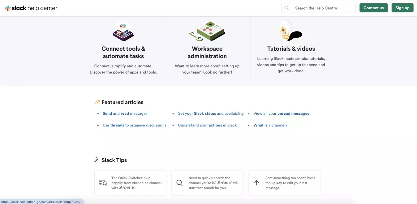
They have a very clear search bar, allowing users to search for anything they need, and they offer quick access to topics and resolutions that are the most common. These categories are then clearly defined by subsections, making it easy for users to save time and effort. 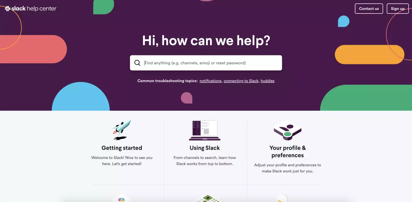
As a little plus, the Slack Tips at the bottom of the page is a nice small touch that gives suggestions to Slack users for better efficiency.
As for the style of Netflix’s knowledge base, it’s extremely minimalistic and very clean, which can be a great benefit for users, because the more straightforward a platform is, the easier it is for them to use it.
Right under the search bar, there are options users can pick from, which are the most popular topics that they tend to be interested in. 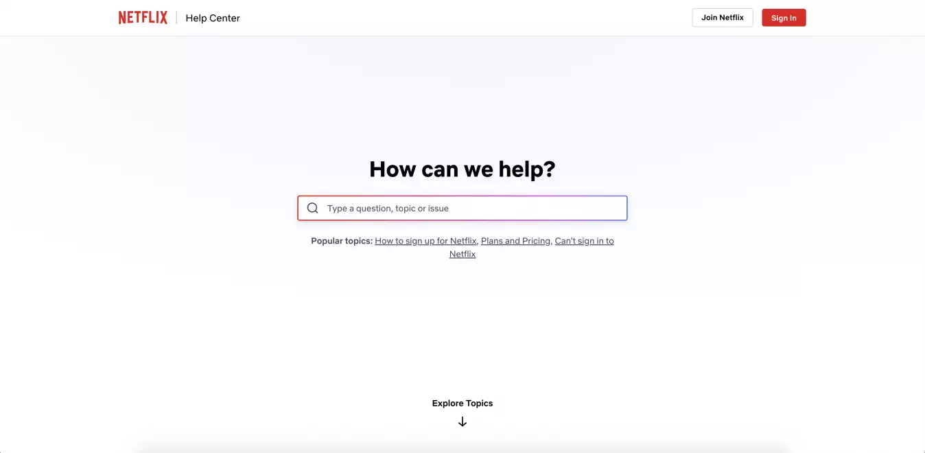
If you scroll down, the topics, issues, and processes are in different sections, divided by subsections as well for further clarity. The help articles themselves are detailed, step-by-step guides, often including icons as well to help users see where need to click. 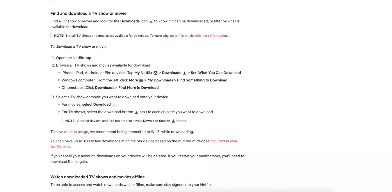
The bottom of the page provides quick access to links that are often searched for, and also an option to contact support if there’s a need for further assistance.
Canva is obviously famous for its designing and editing features, so evidently, their own Help Center is also very stylish and appealing.
As usual, there is a search bar, and similarly to Netflix, they offer popular topics at the bottom for better reachability. Beneath that, you can search by topics, or read top articles, also divided by categories such as pro, teams, education, or non-profits. 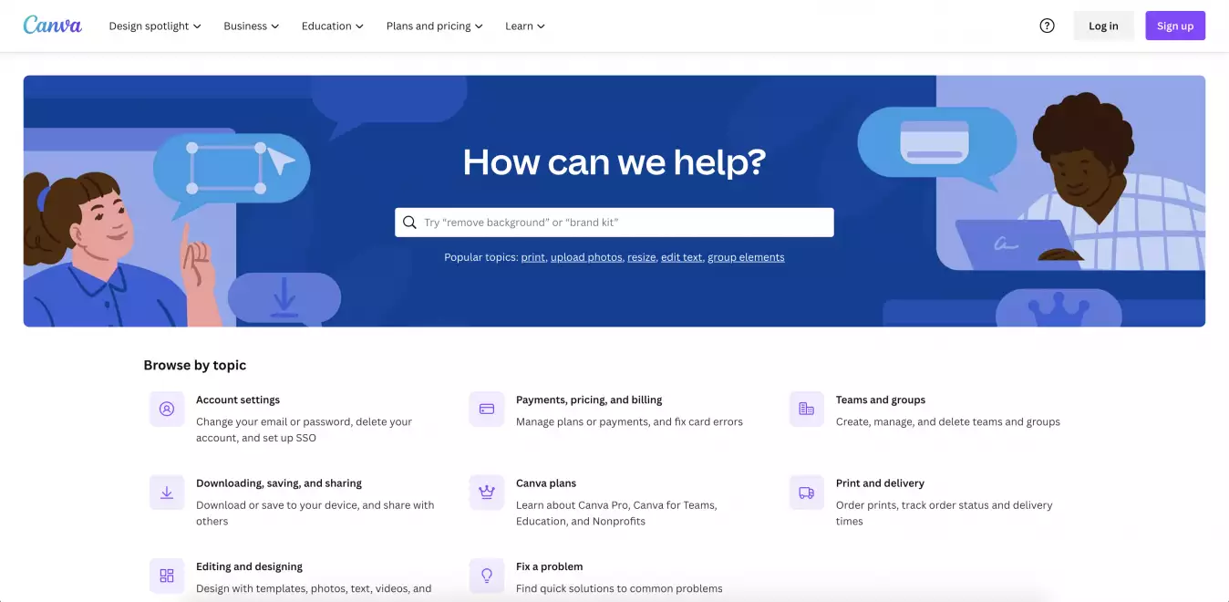
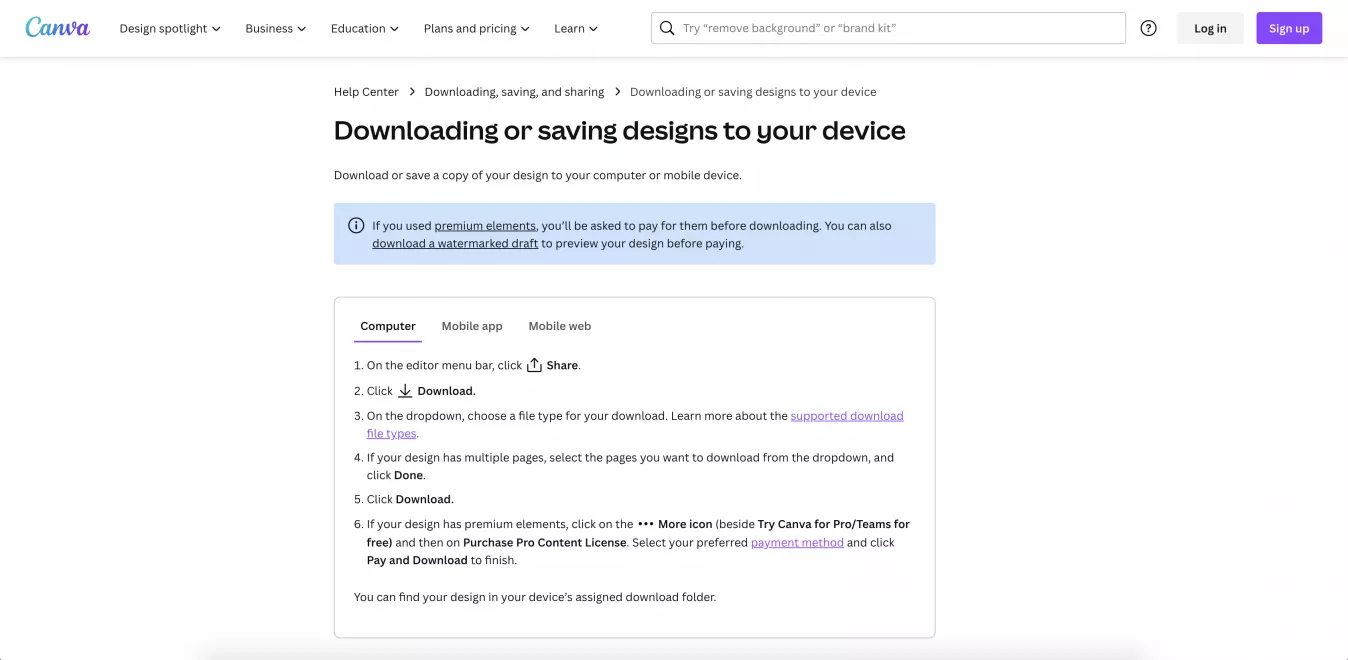
In their articles, they detail the needed steps, plus, they provide an explanation of processes on different platforms, such as on the computer, mobile web, Android app, or iOS app, depending on what the customers use.
We all know that Apple has an outstandingly large plethora of products they sell, thus, their knowledge base must be really extensive. Such huge amounts of information need to be organized carefully in order to be easily accessible and searchable.
Apple solves this issue by immediately categorizing information based on the type of product users want to search for (iPhone, Mac, iPad, watch, etc.), so the initial step of the search is already divided into subcategories. 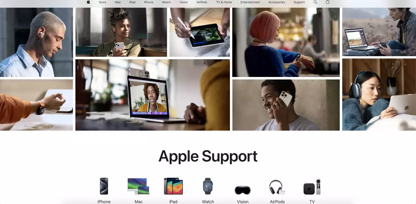
Under that, Apple offers topics that are the most popular (forgot Apple ID password, Apple Repair, and so on). Additionally, there is also a search bar that helps customers if they are looking for a more complex, less popular solution.
Apple does a great job at guiding users to find what they need based on the product they use. Their knowledge base aims to provide insight and save as much time as possible for the customers.
What makes Shopify different from other platforms is that there is a chat window right within the knowledge base. The virtual Help Center assistant asks you what you are looking for, and you can simply type in your questions, and the assistant will answer, while also providing additional resources in the chat and next to the chat where you will find related articles to your question.
There are also traditional solutions in the Help Center, like the numerous choices customers can choose from and navigate to specific topics, and the step-by-step guides in articles for better understanding.
It’s also a plus that several of their articles contain additional tips and suggestions, some of them even guiding users to their YouTube videos.
We could see some great examples of what an excellent Help Center looks like and what it should include. But let’s wrap it up in a list:
And there you have it. An efficient and very much customer-friendly knowledge base that provides support to everyone who is using your products or services.

 Csilla Fehér

 Csilla Fehér

 Csilla Fehér